August 12 2020
What Heatmaps Can Tell You About Your Website and Its Users
Imagine what you could learn about your website if you could see how your users were moving their mouse, clicking on buttons, or scrolling through your website. Thanks to the data found in heat maps, you can view those behaviors and more. In fact, when viewing heatmap analytics, you can determine if and where users are getting stuck throughout a tracked landing page, whether visitors are utilizing your website’s navigation as intended, the content they are finding most useful, and other opportunities for improvement.
Since we began using heatmaps several years ago, it’s become a staple of our data analysis. In this blog post, we outline the different types of heatmaps and how our Conversion Optimization and SEO Specialists use them to make websites more user friendly and optimized.
What Are Heatmaps?
When a heatmapping tool, such as HotJar, is applied to a webpage, it will demonstrate the way users are interacting with the page itself. There are a few types of heatmaps and each one can provide you with a lot of information about what your visitors are doing when they land on that page.
Click Heatmaps
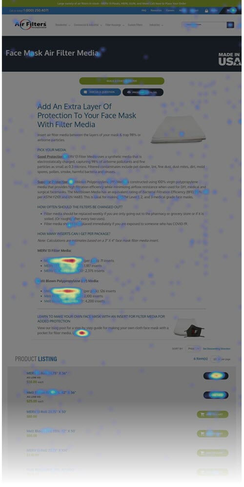
The “Clicks” heatmap shows which areas on the webpage are being clicked on the most by users.
This view is one of the most useful as it shows the user’s interaction with your website. It can tell you whether the on-page elements are being interpreted correctly and how your website users are interacting with those individual elements. The more the colors are in the red and yellow range, the higher the number of clicks that element is receiving.
Movement Heatmaps
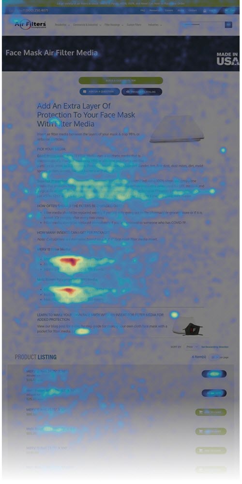
The movement view is used to see what items are being hovered over the most and the direction a user’s mouse is going on a page.
The areas where users tend to hover over the most will be bright red. Even though a user might not be clicking or taking any actions on the page, by hovering over certain areas, you can see what parts of the page your users are deeming as most important.
Scroll Heatmaps
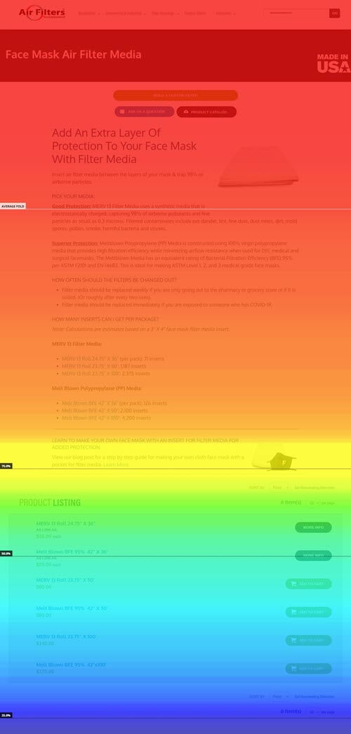
The scroll heatmap view shows how far users are scrolling down while viewing your landing page.
This view will help you understand how far down a landing page your users will typically read. In the example, you will see the entire page as a heatmap with 100%, 75%, 50% and 25% markings for each section starting with red, then yellow, and so on. This is helpful to determine if important content is being missed because it is too low on the page.
Detect User Behavior Trends & Areas of Opportunity
Heatmapping is one of the best ways to truly visualize trends. Just as Google is consistently updating its algorithm for the best search landscape experience, user experience is coinciding with the landscape and user’s perceptions of sites.
Content is one of the most important aspects of a website. With heatmaps, you can identify opportunities for new content. Using the “moves” and “clicks” views, you can see how users are moving and clicking within your website’s existing content. Through this view, new content expansion opportunities might be found because you can see that users are clicking on bullet point items that don’t have their own dedicated page.
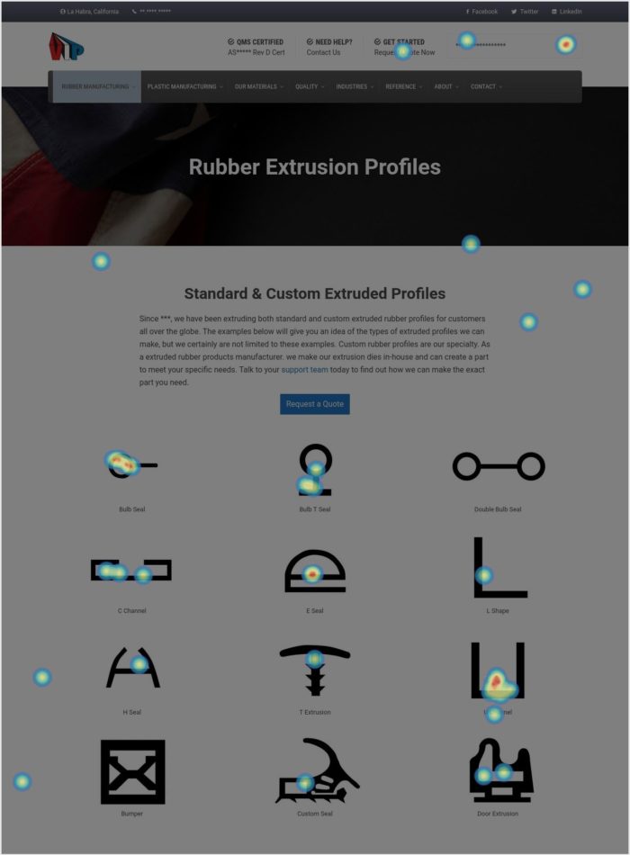
For example, when reviewing this click heatmap for a rubber and plastic extrusion company, it was clear that users were attempting to learn more about the types of extruded profiles provided by the manufacturer by clicking on the page’s icons.
The Team identified this opportunity to improve the user experience and recommended building out new pages, one for each shape. This led to an improved experience for the website’s users and new areas of growth for the business.
There are times where a design element is created and users interact with it differently than intended. For example, users might mistake a design element of the page to be clickable, which you would be able to identify on a “clicks” heatmap. This creates an opportunity to improve the user experience by either changing the design element to make it more clear to users or by creating something for the users to click through to. Either way, you are improving user experience with information you might not have otherwise.
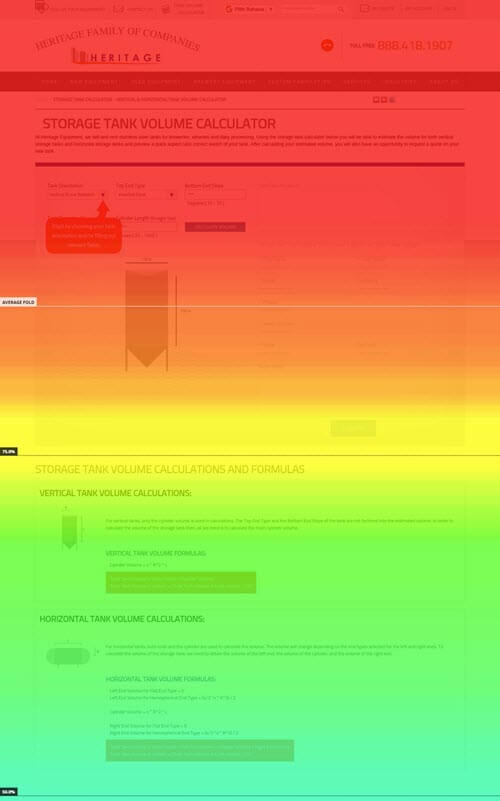
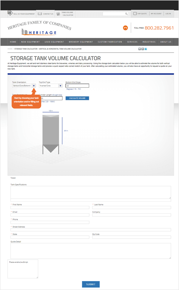
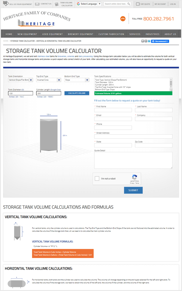
For example, when viewing the scroll heatmap of a Tank Volume Calculator page that had a recently added form to the bottom of it, the Team noticed that users were interacting with the calculator, but not scrolling down further to see the form. Based on this information, the layout of the page was updated and the form was moved to the right-hand side of the calculator.
Since then, form submissions from the Tank Volume Calculator page have increased by 157.14%.
Before and After of the Calculator Page
Data-Driven Website Design
Although a new website is typically built with user experience in mind, it can be helpful to review heatmap data when planning for a new website, and also after launch.
For instance, when reviewing heatmap data during a website redesign, you can identify and ensure that the areas where your users are currently interacting with are carried over to your new design. Heatmaps can also be your second set of eyes after launching a new design to guarantee that your users are easily interacting with new features.
Even long after a website is launched that doesn’t mean there aren’t areas that could be adjusted. With the continuous evolvement of website usability, a widget or layout in the current version of the site could have a completely different meaning to the customer in the future.
What Does This Mean For You?
Having a heatmap on some of the pages of your website provides great insight as to how users are navigating it. It’s a tool we use for many of our clients to review interactions with the website and if there are any improvements that could be made. Every business is unique, therefore their users are unique so it’s great to see how your particular users are utilizing your website.